← Steve Rayner
A user-centred card application process
Overview
User testing, heuristic analysis and competitor research laying the foundation for an improved card application process.
The brief
The client required an in-depth analysis of the card application process to understand shortcomings and implement changes based on insights gathered from users.
Research
Two UX designers carried out a heuristic review of the online process for both desktop and mobile views. The results of each heuristic were scored - poor, moderate or good.
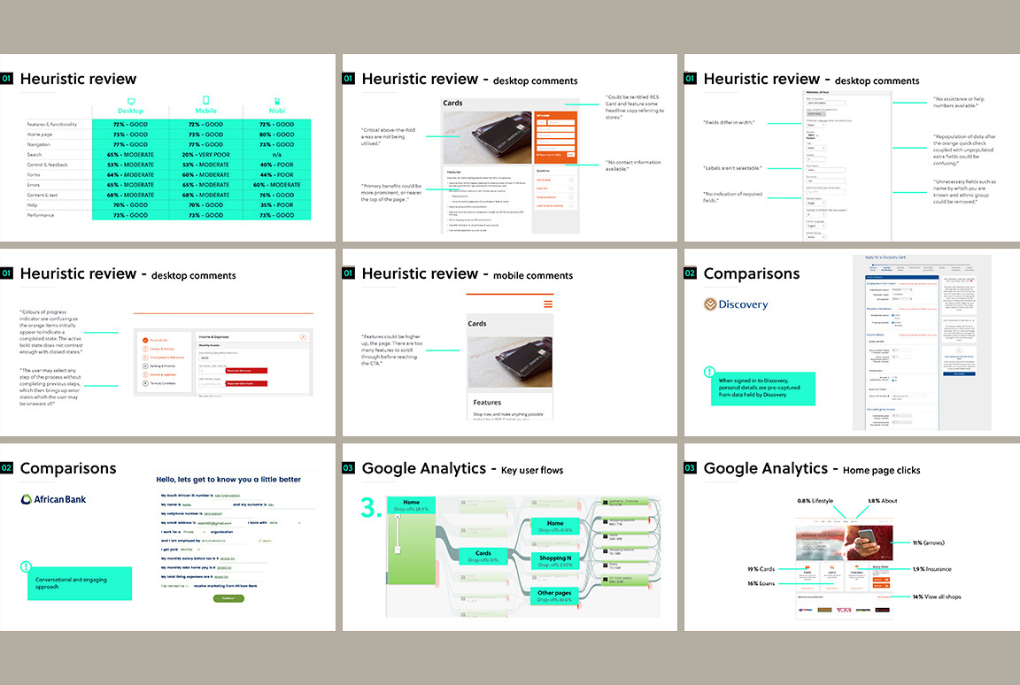
Competitor analysis surfaced current best practice and features such as pre-populated data, conversational approaches and data saved at each step in the process. To complete the research phase, Google Analytics provided quantitative insights.
Testing
By mining the client's existing customer demographics, four assumptive personas were created to inform user test recruitment criteria. Eight recruits were observed whilst 'applying for a card' (five mobile and three desktop using Lookback).
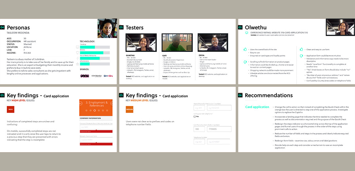
Notable issues (some which confirmed those identified in the heuristic review) included a lack of initial orientation and expectation, field error messages displayed only when moving to the next step and grouped above the fold, difficulties populating phone number fields and, interestingly, questions as to the need for a selector requiring an input of the user's race.
Prototyping
Through affinity sorting, feedback was collated and prioritised. A prototype at the right fidelity level for believability was created and tested against five new recruits.
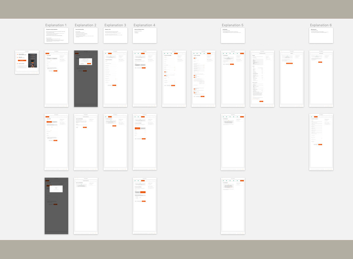
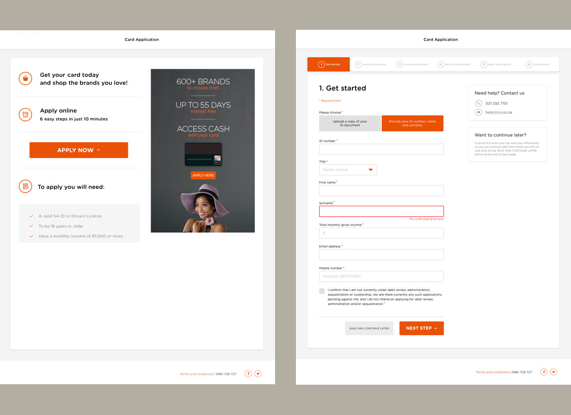
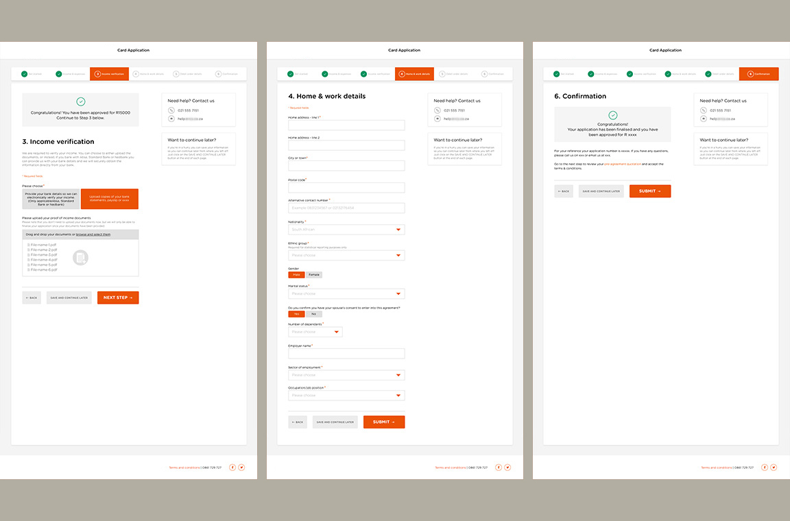
Changes included the addition of an orientation page, equal width fields for visual consistency and colour-coded way-find indicators. Minor issues were corrected before presentation to stakeholders.